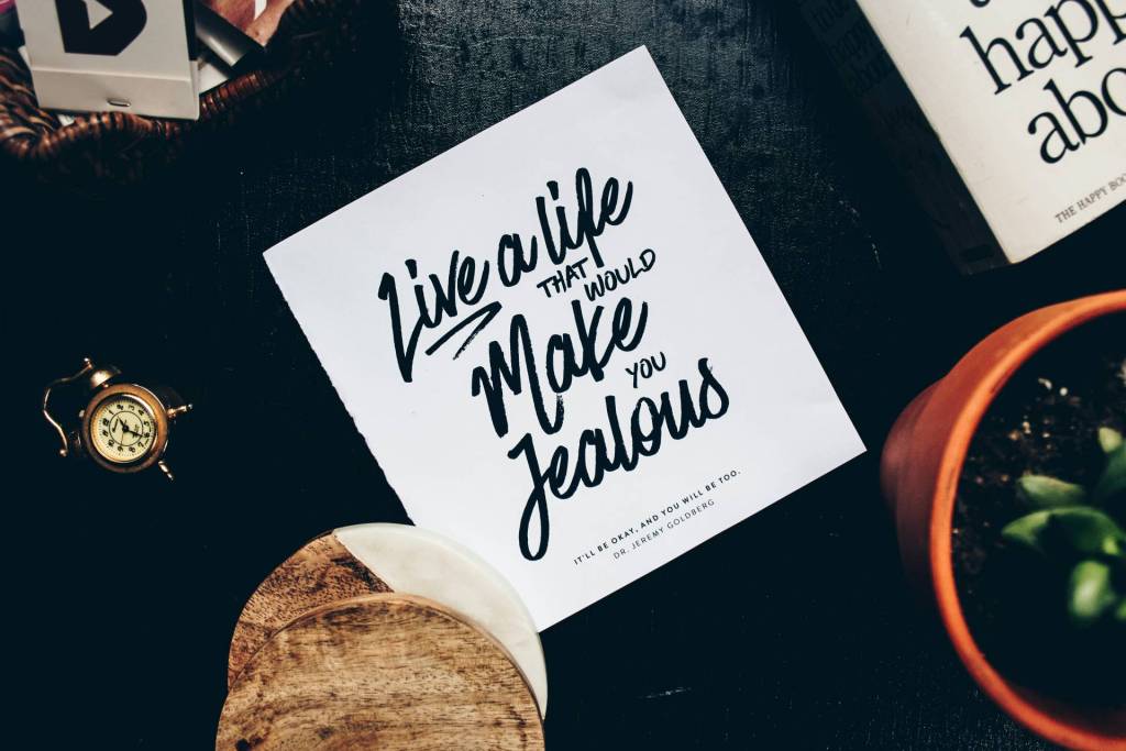
There is an ever-increasing importance for everyone to have their own self-brand. What was once a concept used for business purposes only, has now become a new form of identity for the professional seeking jobs or clients.
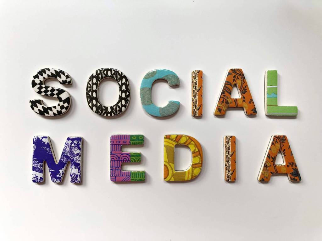
Branding has a visual expression component
Branding puts a visual to a name, and establishes an idea of how an individual wants to portray himself or herself. That said, a lot of people don’t fully grasp the importance of typefaces. Whether on business cards or websites, typefaces should be carefully chosen.
This is especially important in the world of electronic and digital media, as most media professionals will tell you that each typeface has a different meaning and emotion attached to it.
What to avoid
When establishing your personal brand identity, avoid using these typefaces:
1. Arial & Times New Roman. These typefaces are most appropriate for branding someone who has no personality whatsoever. Because these typefaces are most commonly used in documents and spreadsheets, they are more likely to ward of potential employers or clients more than draw them in. While these typefaces are appropriate for resumes, contact info on business cards and blog posts, they should never be the featured.
2. Comic Sans MS. Unless your target audience is between the ages of two and eight years old, Comic Sans MS is one of the worst typefaces you can possibly use when creating your brand identity. It’s shameful to imagine how many people actually use this font for everyday use. The fact that so many people use it is enough of an indication that you should stay away from it if you want to appear unique to employers. This typeface is “cute,” with its slightly crooked letters and defined spacing, but is also elementary. By using this typeface, you may be insulting the intelligence of the person viewing your website or business card.
3. Papyrus. You don’t have go to an online university or be any kind of expert to know that Papyrus is one of the most hated typefaces in existence. A lot of people–even professional designers–still use this font because they either think it looks natural or rugged and alternative. The truth is it’s none of those. Rather, the typeface itself is literally rough around the edges. Using this font, you would be giving the same impression of yourself, which is a quality most professional employers aren’t looking for in candidates. It’s best to just stay away from this font altogether.
4. Curlz MT. This is yet another intelligence insulting typeface. While the little curly tails on some of the letters are cute and girly, it still doesn’t mean you should use it. It gives off the impression of immaturity and superficiality, which are qualities nobody–especially women–would want to associate themselves with. This is also another typeface that is incredibly, and unfortunately, overused. Using this font not only gives a bad impression of you, but of your creative ability and originality as well.
5. “Hand” Typefaces. If you have ever received an invitation in the mail, or even online, you have probably seen “hand written” typefaces. While these typefaces were intended to have the appearance of customization, they are also widely overused.
Losing the air of personality
Because so many people use them, they lose that air of personality. If you like the idea of using a “hand written” font for your personal branding, consider using an online font making service that can turn your handwriting into a legitimate, usable font. The most important thing to remember when creating your personal brand is that you want to stand out.
Your branding should be carefully planned out, making sure that each element on your business card or website, or other forms of branding are consistent and have a purpose. Thousands of free, unique fonts can be found online, as is plenty of advice on how you can make yourself stand out against the competition.
Author:
Nathaniel Broughton is a veteran internet entrepreneur and investor. Dating to 2002, he has helped produce 3 Inc 500 award-winning companies. Nathaniel owns Growth Partner Capital, a venture fund that provides SEO consulting, premium link building and online reputation management services. He is also owner of SuretyBonds.com, a nationwide bonding agency. Previously he served as CMO of VAMortgageCenter.com, a $65 million nationwide mortgage bank which acquired his marketing firm Plus1 Marketing in 2008. A resident of San Diego, Nathaniel often writes from his experience as an investor, marketer, and advocate of “networking like Paris Hilton parties – Nonstop”. Follow him on Twitter – @natebro.