The renowned design company Metalab has recently undergone an extensive rebranding campaign. Flaunting a revamped logo, trendy typeface, and streamlined wordmark, the brand presents itself as a ‘seasonal’ symbol of growth and transformation. This rebrand inherently conveys Metalab’s dynamic spirit and readiness for change and evolution.
Established in 2006, Metalab has significantly diversified over the years. From a singular focus on interface design, it now boasts an array of services including product research, strategy, development, and brand design. Notably, the clientele has grown in tandem, encompassing varied industries and big-wig corporations like The Atlantic and Yahoo.
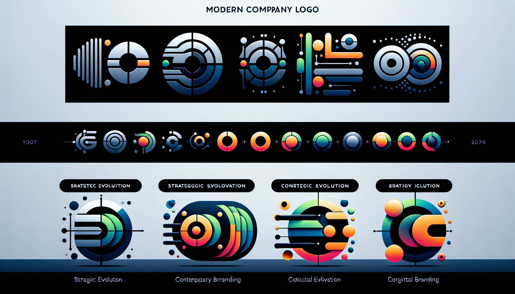
This rebranding isn’t merely an aesthetic upgrade for Metalab, but intends on redefining its public image. With its innovative wordmark, new font, and monochrome color scheme, Metalab 2.0 aims to reach a broader audience and emphasize the company’s evolution. This rebrand penetrates deeper than just visuals, influencing the firm’s PR, marketing, and interactions to keep up with industry dynamics.
Sarah Vienna, the VP of Design leading this rebranding, stated that the old branding served its purpose for a while, but growth and evolution necessitated a change. She affirmed that the rebrand was the best strategy to reflect the company’s development. The new brand ‘Elevate Designs’ is an accurate representation of Metalab 2.0’s relentless commitment to excellent design solutions and progress.
Significant transformations were also performed on the corporate emblem and color scheme. The previously purple-dominant palette has been replaced with a broader spectrum, and the geometric flower motif has evolved into a stylish hollow-centered star. Moreover, tweaks to the typeface have resulted in a sleeker design aligned with the new brand ethos. All these changes reflect the brand’s evolution while preserving its core values.
The brand has also introduced a 3D version of the star symbol, poised to be a standout feature on the official website. The symbol provides flexibility for varied styles and textures, chiefly in recruitment sections, reiterating the brand’s innovative spirit and adaptability.